Calculating Cross-Price Elasticity and some tricks in R.
Raise or lower the price? How much money could we actually make? How sensitive are people towards price change?

One way to figure this out is dynamic pricing. However, there are simpler methods especially when you know how to run a regression. Let’s download the UCI retail dataset to see what we can discover.
library(tidyverse)
library(caret)
library(readxl)
Here is a small sidenote.
Reading in from Excel is usually a simple thing, usually we just find the file in our working directory and read in the path.
path <- "https://github.com/tykiww/projectpage/raw/master/datasets/UCI-Retail/UCI-Retail.xlsx"
# read_excel(path)
gc()
## Error: `path` does not exist:
##  ‘https://github.com/tykiww/projectpage/raw/master/datasets/UCI-Retail/UCI-Retail.xlsx’
However, readxl does not actually work for reading in from online. To do so, we must specify a temporary location to store a download.
temp <- tempfile(fileext = ".xlsx")
download.file(path, destfile = temp, model = 'wb')
retails <- read_excel(temp, sheet = 1) %>% as_tibble
There we go!
Now that we have our data read in, let’s pick an object from the data that has a high volume. The more information, the better.
grep("CALCULATOR",retails$Description) %>% length
grep("HANGER",retails$Description) %>% length
grep("LUNCH BOX",retails$Description) %>% length # This one!
grep("ALARM CLOCK",retails$Description) %>% length
ind <- grep("LUNCH BOX", retails$Description)

retail <- retails[ind,]
Lunchboxes it is. Let’s move on to seeing how sensitive individuals are towards price change. The most important information here is the Quantity and UnitPrice. Let’s snag those and clean the data.
# quick clean
retail1 <- subset(retail, retail$UnitPrice > 0)
retail2 <- subset(retail1, retail1$Quantity > 0)
elast <- select(retail2, Quantity, UnitPrice)
# plot
rm(retail,retail1,retail2, temp, path)
gc() # garbage collection to clear out data.
Let’s jump straight in with the model. Typically, we may need to remove outliers and influential observations. However, for the sake of time and computational power, we will move right on.
There are many methods to calculate price elasticity using software. Since Elasticity is defined as the percent change in quantity divided by percentage change in price, we will be comparing 2 models using software. 1st is the most commonly seen, the level-level method. 2nd is the more ‘accurate’ model measuring the log-log elasticity. If you want a refresher on what elasticity is, click here.
Method 1: (Level, Level) PE = (ΔQ/ΔP) * (P/Q)
This method is simple (so is the other one). We plot X and Y, then use the beta coefficient as the change in price and quantity. Aftwards, we will multiply P/Q by the most typical value. Since the data is both right skewed, we will use the median values.
out.el <- lm(Quantity ~ ., data = elast)
levelast <- out.el$coefficients["UnitPrice"]*median(elast$UnitPrice) / median(elast$Quantity)
levelast
# level-level model
ggplot(elast,aes(y = Quantity,x = UnitPrice)) + geom_point(color='steel blue') + geom_smooth(method = 'lm', formula = y~x, se = FALSE, color = 'forest green')
## UnitPrice
## -5.991306
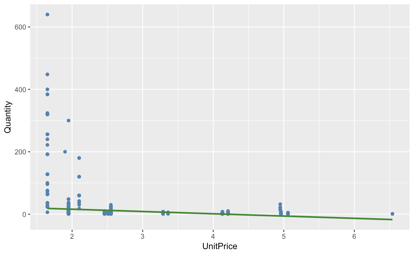
Our R squared value is below 0.05 which seems to be rather low. However, we may interpret this coefficient as such: A one percent change in price will decrease the amount of lunchboxes sold by over 500 percent. There is evidence to suggest that quantity of lunchboxes demanded is very responsive to a change in the good’s price.
Maybe this data is not as useful in predicting. There may be two factors to this. 1. If we take a look at the labeled data, we notice that this data is comprised of retail throughout subsets of different countries (No wonder our values vary so much). and 2. There are clear outliers in the data when plotted and obvious skewing. Our log transformations should help.
Method 2: (Log, Log) Coefficient % Change output.
out.els <- lm(log(Quantity) ~ log(UnitPrice), data = elast)
out.els$coefficients[2]
# log-log model.
ggplot(elast,aes(y = log(Quantity),x = log(UnitPrice))) + geom_point(color='steel blue') + geom_smooth(method = 'lm', formula = y~x, se = FALSE, color = 'forest green')
## log(UnitPrice)
##      -1.998695
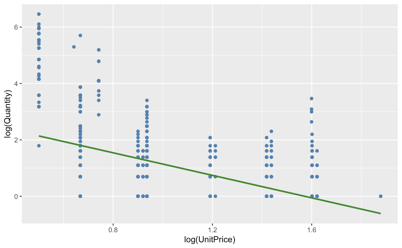
We notice that the model has reduced skewedness with a lower MSE and better Rsq value. This is more indicative of the correct model. The interpretation of this output is the same as the last, however with more accurate results: A one percent change in price will decrease the amount sold by 199% percent. We notice that the elasticity is negative, yet below -1 making it very inelastic (the percentage change in quantity demanded is larger than that in price). Depending on where we price our object, we should be able to determine the optimal price opint for this demand.
Let’s make some predictions. Our optimal Price formula is given by…
## Optimal Price = (Elasticity * Total Cost per Salad) / (1 + Elasticity)
If we were to assume that the store’s per-unit variable cost is around 1.95, we may model our elasticity as such..
costperbox = 1.95
elasticity = out.els$coefficients[2]
(elasticity * costperbox) / (1 + elasticity)
## 3.902547
This is good news. By ensuring our price to be near 3.90 per lunchbox, we have optimized for this particular dataset. Of course, we had not breaken down seasonal trends, other factors, nor have we created an interval (use the predict function with the parameter interval as ‘prediction’ for that.). However we have been able to figure out the optimal price from our price elasticity of demand. Now the lunchbox business is back on track.
Hopefully this was a useful tool in determining your next pricing project!