Marketing Analytics?

This post today isn’t huge news. It’s a well used technique, probably the most common tool used amongst Web Content Marketing. A/B Testing. It’s a rather simple method that compares 2 “variants” and takes a look at their performance.
The groups are split into two. Usually with the same length of test subjects for both (doesn’t always need to be). The two are identical, with the exception of one variation that might affect a behavioral change by the other user. For example, a website owner might want to test the effectivity of a stock image as the main image as opposed to a photo of the company to increase free trial rates. They would test the difference, reflecting a potential increase of the bottom line.
Some confuse it and see similarities with the ANOVA hypothesis testing and paired sample t-test, but we have to be very careful in distinguishing the differences.
- We immediately notice that the ANOVA test is out of question, as it is a test that looks for differences in means of multiple groups. A/B only has 2. For that, taking a look into multivariate testing will be in our benefit.
- We are in a weird territory where product and the response from both populations are tested. However, the experimental unit (population of interest) really is the people (we can tell by where the deviation really comes from). Therefore, we should be closer in relating this method to Welch’s t-test, which accounts for differences in population variance. Yet it is clear that we are not looking for differences in means. Let’s just say it can be used as a tool within the A/B test to see if there is a statistical difference.
I have rarely seen this applied in situations other than user experience and web content marketing (though it easily can be). My assumption is that this is heavily used within the web sphere due to the ease of data collection. Economically, I would assume more utils per cost to retrieve data in that sense.
We will begin right away. As always, my general use tidyverse package may come in handy, but is not really necessary. We will need the chron package to separate our date and time variables as well.
library(tidyverse)
library(chron)
Say that we collected data on two types of website layouts. One looks like this:

The other like this:

You see the difference? Just a slight variation, but the font change is noticeable enough. The data collected (of course, it’s made up) is the frequency to which (A) the posts were clicked from the first layout, or (B) the post click frequency by the second layout. Of course, I have no marketing agenda, but it would be nice to direct an individual towards a specific part of my site. You can download the data from my repository.
a <- "https://raw.githubusercontent.com/tykiww/projectpage/master/datasets/WebAB/WebAB.csv"
dat <- read_csv(file = a)
View(dat)
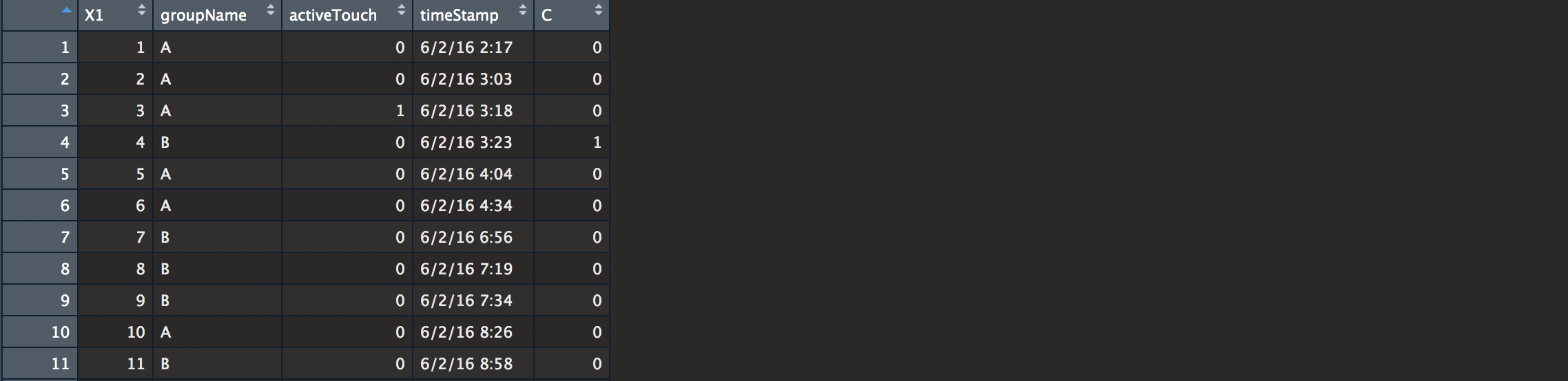
We see here our information. Our columns are labeled for the data count, layout name, a boolean for whether or not the link was clicked, when it was clicked, and a last column that randomized the clicked column just in case our data was not interesting enough (do NOT do this if you really want to test. Pretty Obvious..). We’ll begin by cleaning.
# Timestamp creation.
# could also use separate(), but it seems like chron() likes it in a particular fashion.
dt <- dat$timeStamp %>%
  strsplit(" ") %>%
  as.data.frame %>% t()
row.names(dt) = NULL
# changing date & Time to chron
dt[,2] <- paste(dt[,2],":00",sep = "") %>% as.character
b <- chron(dates=dt[,1],times=dt[,2],format=c("d/m/y","h:m:s"))
# combining data
info <- data.frame(dat$groupName,dat$activeTouch,b)
colnames(info) <- c("groupName", "activeTouch", "dateTime")
info # cleansed!
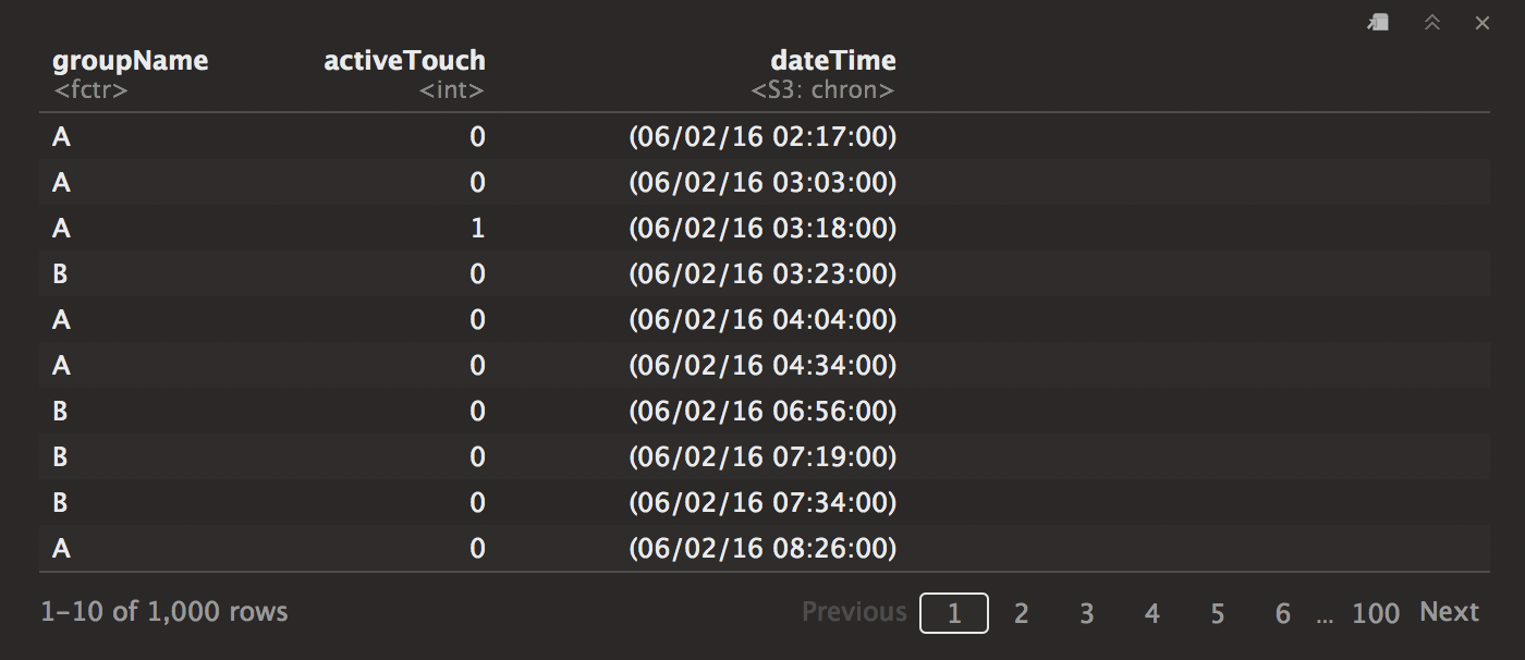
Here is our data. Now let’s look at some of the details. 1 stands for the number of clicks, whereas the 0 stands for the frequency for which it hasn’t been clicked.
fqtb <- table(info$groupName, info$activeTouch)

It looks here that the B clickpath has been utilized more than A over the small period. If we were to use a quick check with confidence intervals, we will see if there is an observed significant difference. We look mostly at how much more one test beats out the other test.
A1 = c(20/500 , 500) # layout A
B1 = c(40/500 , 500) # layout B

abconfint <- function(a, b){
  q <- qnorm(.975)
  std.er1 <- sqrt( a[1] * (1-a[1]) / (a[2]) )
  std.er2 <- sqrt( b[1] * (1-b[1]) / (b[2]) )

  confinta <- c((a[1] - q * std.er1), (a[1] + q * std.er1) ) %>%
    round(3)
  confintb <- c((b[1] - q * std.er2), (b[1] + q * std.er2) ) %>%
    round(3)

  list(" Confidence Interval for A" = confinta, " Confidence Interval for B" = confintb)
}

abconfint(A1,B1)

Interestingly, their means are pretty far apart, but we notice that the confidence intervals seem to overlap. Some make the mistake and suggest no statistical significance. However, we have to be very careful before we make the immediate conclusion that the p-value is below 0.05. Let’s instead go for a proportion test of equality (note here that our data is better interpreted with levels arranged conversely).
prop.test(fqtb)

We finally conclude that there is statistical significance at alpha = 0.05. It isn’t that we should have checked the chi-squared prop test at the beginning, but using both the p-value and the confidence interval, we notice the difference “by its size”.
Now we have our information sorted, let’s vizualize our data just for show. Unfortunately chron is a bit difficult to plot, so we will forego the specifics and leave x as it is. After noticing that the clicks happen sequentially, we can just sum them up over time.
# separate A and B
A <- subset(info,info$groupName=="A" & info$activeTouch==1)
B <- subset(info,info$groupName=="B" & info$activeTouch==1)

# change to frequency over time!
c <- c()
d <- c()
for (i in 1:nrow(A)) c[i] <- sum(A$activeTouch[1:i])
for (i in 1:nrow(B)) d[i] <- sum(B$activeTouch[1:i])

# Vizualization time.
qplot(dateTime,c,data = A)
qplot(dateTime,d,data = B)

ggplot(A, aes(dateTime, c), color = "black") + geom_line() +
  geom_line(data = B, aes(dateTime,d), color = "red") +
  xlab("Time") + ylab("A/ B clicks") +
  annotate("text", x = 17000, y = 5, color = "black", label = "A") +
  annotate("text", x = 16950, y = 30, color = "red", label = "B")

Right here, we notice immediately that B has been outperforming A at a faster rate even without looking at the significance statistics. This graphic is probably something you want to show to your web content manager as a companion to your confidence interval and p-value. Your suggestion for these changes can go a long way! Even a small 2-3% change can go a long way especially if you deal with volumes of traffic (which mine does not).
Some may say people click due to the aesthetics. Maybe so, that’s just not something we controlled for. Some may just say it is due to chance. Maybe so, however, our data shows that it is more than likely NOT due to just chance alone.
Regardless, we have ourselves a handy tool for measuring performance outcomes against unknown tests. Use it however you like! Hope it serves you well.