How many visitors will we expect to see in Yosemite National park for the next 5 years?

What’s our model?
To answer this question, we will use a simple timeseries model of an ARIMA(1,1,1). Also known as the Box Jenkins Method (one method of using an ARIMA time series), it is one of the most general class of autoregressive models for forecasting a time series (Well, you could get more general if you’d like).
Simply, the 1,1,1 stands for: last period’s change, year to year change, moving average. These details may be fine tuned according to how the data looks, but as a general guideline, the ARIMA(1,1,1) is beneficial and accurate for most cases. For the lowest AIC, you’ll need to tweak it to your liking (A gridsearch for the three parameters may be useful). If that didn’t make much sense or you are curious, visit this link. Though it does not use the same package, it will take you through steps to dealing with autocorrelation and parameter selection.
Exploratory Data Analysis
That’s enough of the stats lessons. Let’s actually try fitting the model to the Yosemite data!
For the annual visitors data, let’s download a dataset from the National Park’s service STATS website. The information spans from the inception of the park up until the last calendar year, and since it’s only the beginning of 2018, the data runs until 2016. Might be fun to see how accurate these next predictions will be once the 2017 data comes out!
For a more in-depth analysis, we would hunt for park event details but for today we are just focusing on the information at hand. Normally, it wouldn’t be a bad idea to scrape the information, but the dataset was so small, the csv was downloaded and copied through a simple read.table().
Yos <- read.table(header = TRUE, text = '
Year	RecreationVisitors	TotalRecreationVisitors
1906	5,414	190,404,561
1907	7,102	190,404,561
1908	8,850	190,404,561
1909	13,182	190,404,561
...
2014	3,882,642	190,404,561
2015	4,150,217	190,404,561
2016	5,028,868	190,404,561'
)
Now, to perform an analysis, these strings need to be numeric and so we can plot the data to take a look.
Yos$RecreationVisitors <- as.numeric(gsub(",","",Yos$RecreationVisitors)) #Gsub all the commas with no spaces.
Yos$RecreationVisitors <- Yos$RecreationVisitors/10^6

plot(RecreationVisitors~Year,
     data=Yos,type="b",
     ylab = "Yosemite Annual Visitors (In millions)")
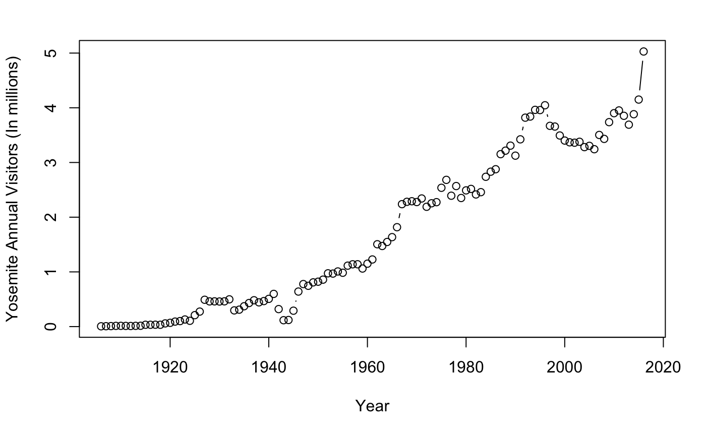
We notice a slight multiplicative curvature of the graph. This may not be in our interest. To fit any linear-type model,we should make our information additive to predict future values. Fortunately, this is a simple fix. By performing a log transformation, we can see how the data becomes more readable (any other transformations will work as well).
Yos$lnvisitors <- log(Yos$RecreationVisitors) #Log transformation
plot(lnvisitors~Year,
     data=Yos,
     type="b",
     ylab = "Yosemite Log Annual Visitors (In millions)")
abline(v=1941, col="red")
abline(v=1946, col="red")
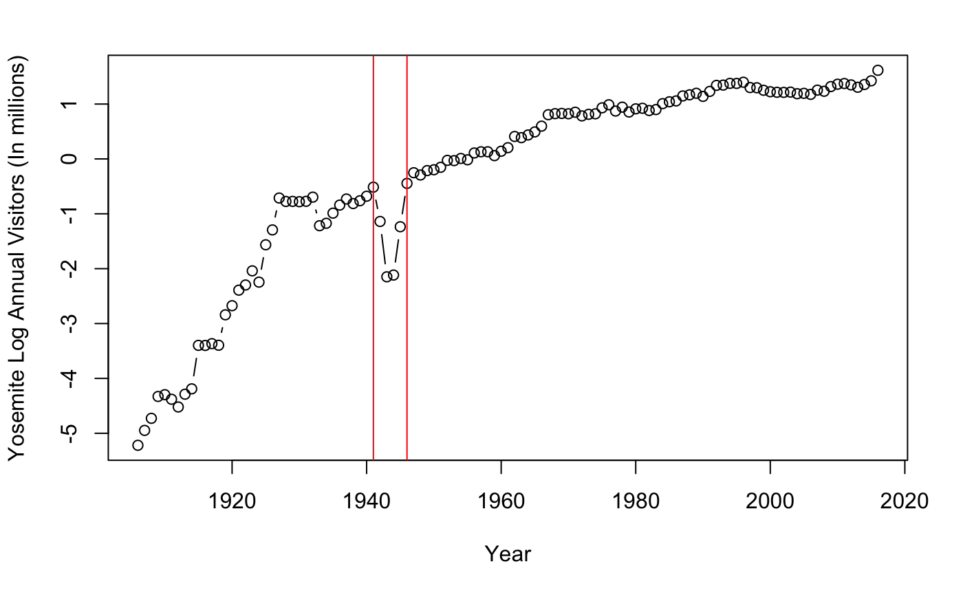
How simple! The graph appears to be additive from 1930s to present but has a dip between 1940-1950. Looking closely, Non-constant mean changes occur from 1941 to 1946. The dip seen from 1940-1946 roughly fits the time period of world war 2. This may suggest that wartime may have changed opportunities or interest of individuals. Some other possible causes for the curvature from 1920s to 1946 may be due to an increase in exposure, interest, and transportation. Good to think about.
However, this makes the data useless! We will need to subset the data to after 1945. By subsetting, we notice a more additive model that suggests less if not any changes in behavior or policy from year to year. With this subsetted data, we observe a more constant mean change that reflects future Yosemite tourism demand. There are other ways to deal with bad data, imputing or just omitting one point is not too big of a problem. However, with enough data and time, this shouldn’t be too big of a deal.
Yos[Yos$Year==1945,] #Subset to after 1945
Yos46 <- Yos[-(1:40),]

#plot again to check for additive model
plot(lnvisitors~Year,
     data=Yos46,
     type="b",
     ylab= "Yosemite Log Annual Visitors (In millions)")
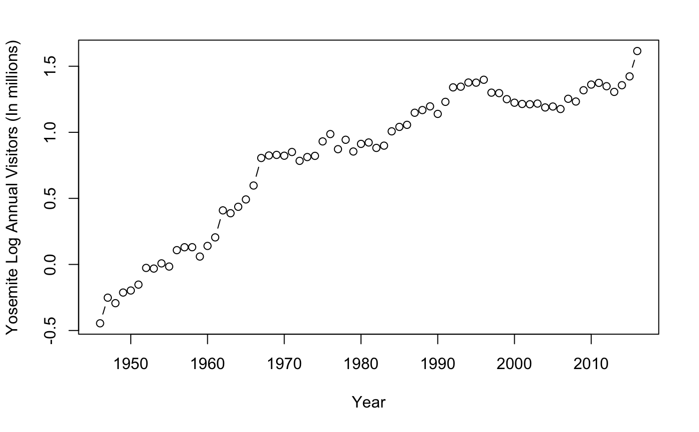
Everything looks great! Now that we have an additive model subsetted to the recent past, we will continue with the forecasting.
The Model
We will be using a specific ARIMA model that comes from the asta package. asta was created by a professor from the University of Pittsburg, and information on time series analysis is on his website. The sarima() function will be of interest as it links all of the past datapoints and gives us parameter estimates. At first you are going to see a list of graphics that show the residual for the 1,1,1 model. We’re going to ignore this for now as we will not be dealing with autocorrelation for this post.
The output ar1, ma1, and constant are the names for phi, epsilon, and mu. This information tells us the parameter estimate mu, and the standard errors.
However, the more applicable portion is done using the function sarima.for(), The prediction element. You can see in Yos46.future how easy it is to fit the arima model. The first element denoting the log visitors, n.ahead being the number of years to forecast, and 1,1,1 coming from the arima function. Immediately, a graphic appears with the prediction values and 95 percent confidence estimates. Of course, these are logged values, so we need to make sure to finish by creating an exponentiated graph that meets publication quality.
library("astsa")

Yos46.out <- sarima(Yos46$lnvisitors,1,1,1)
Yos46.out$ttable[1:3,1]      #Find Parameter values

# Compute predictions for the next 5 years by fitting in an ARIMA(1,1,1) and make a graph
LogYosemiteVisitors <- Yos46$lnvisitors

Yos46.future <- sarima.for(LogYosemiteVisitors,n.ahead=5,1,1,1)
abline(v=71, col = "blue")   #up to 2016


exp(Yos46.future$pred)       #The unlogged prediction values for the next 5 years.
Yos46.yhat <- exp(Yos46.future$pred)
Parameter estimates (ar1, ma1, mu)
##      ar1      ma1 constant
##  -0.6511   0.5499   0.0291
Prediction estimate values
## Time Series:
## Start = 72
## End = 76
## Frequency = 1
## [1] 5.096657 5.301227 5.421584 5.606032 5.755369
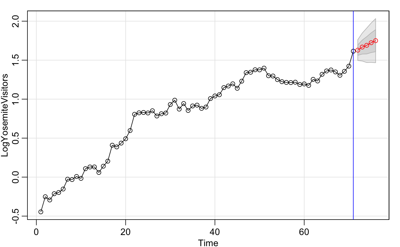
Now all we need to do is represent the forecast values and the 95% confidence estimates along with a better looking graph. ggplot may be better looking, but for the sake of functionality we will stick to base R.
#Above gives us prediction and standard error, so compute 95% prediction intervals
t <- qnorm(0.975)
Yos46.L <- Yos46.future$pred - t* Yos46.future$se
Yos46.U <- Yos46.future$pred + t* Yos46.future$se

#un-transform the log data back to normal

Yos46.yhat.L <- exp(Yos46.L)
Yos46.yhat.U <- exp(Yos46.U)
cbind("parameter" = Yos46.yhat,"lower" = Yos46.yhat.L,"upper" = Yos46.yhat.U)


#The *pretty* not so pretty graph

plot(RecreationVisitors~Year,data=Yos,type="o",                        #Data up until the current year
     ylab="Yearly Visitors (in millions)",
     xlim=c(1980,2021),
     ylim=c(0,7),
     main = "Yosemite National Park Annual Visitors")
lines(2017:2021,Yos46.yhat.L,col="blue",lty=2)                         #lower bounds
lines(2017:2021,Yos46.yhat.U,col="blue",lty=2)                         #upper bounds
polygon(c(2017:2021,rev(2017:2021)),c(Yos46.yhat.L,rev(Yos46.yhat.U)), #Filling in the lines between the upper
        col = "light gray",                                            #and lower bounds in the prediction.
        border = NA)
lines(2017:2021,Yos46.yhat,col="red",type="b",pch=5)
lines(2017:2021,Yos46.yhat,col="red",type="b",pch=3)
Table of the unlogged 95% parameter estimates and CI.
## Time Series:
## Start = 72
## End = 76
## Frequency = 1
##    parameter    lower    upper
## 72  5.096657 4.472109 5.808425
## 73  5.301227 4.446741 6.319912
## 74  5.421584 4.366934 6.730940
## 75  5.606032 4.376368 7.181205
## 76  5.755369 4.362865 7.592320
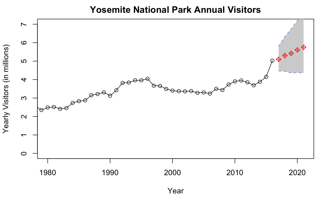
As you may notice, we now have both a table with predictions and a good-looking graph of those future values. Simple huh? This type of analysis is handy for forecasting future performance whether it be for marketing or tourism trends (any type of data that does not involve too much volitility). Oftentimes, you may also see exchange rates are modelled using ARIMA in place of randomwalks and neural networks. Yet there is always a catch! Don’t use this model if you are certain of seasonal trends. The ACF plots that we ignored at the beginning are a good indicator of seasonality (if they cross the threshold). Those situations will be covered in another post.
Conclusion
Some other Arima model assumptions to watch out for may include:
- There are no known/suspected predictor variables
- There are no deterministic time trends of the form 1,2,3,…,t
- There are no one time anomalies (The model parameters are constant over time)
- The error process is homoscedastic.
Since arima is a type of regression using past values (values predicted from year to year), sharp dips and spikes may interfere with the model. This means that arima does not take into consideration any procedural changes, anomalies, or other predictor values that may have actually contributed to any skips in convergence (ie. park closes down, vertical integration of a new financial firm, or even a blizzard that tears through a potato farm). The simplest way to say this is: Just use it as a prediction estimate and not an exact forecast.
Regardless, we’ve done it! The Arima (specifically the 1,1,1) model still continues to be one of the most standard procedures to forecast future values to this day (maybe because time happens to be amongst the strongest predicting elements of nature). Although it is not the best model (do we even know what the best model even is?), it is a general one-size fits all.