In a last posts we went through a non-seasonal ARIMA, looking at annual values, but what if the values we are looking for are not annual, but monthly?
Case
What is the MONTHLY US residential energy consumption for the next 2 years for the ‘Short-Term’
As behavioral economics dictates, monthly values tend to rise and fall according to season. Winter Holidays seem to bring in some the highest volume of consumption during a period. Ice cream sales on aggregate decrease significantly during the winter.
Exploratory Data Analysis
Likewise, energy consumption in the US functions in a similar way. Let’s take a look at how we can forecast the 2-year energy consumption for US residents. Data comes from eia.gov which stores “energy information” including energy sources and news events that may adversely or conversely affect energy acquisition in the US. Finding the right type of data is a little hairy, but luckily there are filters that let you adjust parameters before you download any of the data. We are going to rip the energy data from the ‘short-term energy outlook’ found in the read.csv link.
data1 <- read.csv("http://www.eia.gov/totalenergy/data/browser/csv.cfm?tbl=T02.01")
#subset to TERCBUS Total Energy Consumed by the Residential Sector
data2 <- subset(data1,MSN=="TERCBUS")

#subset to "my lifetime" because energy consumption
#has changed drastically from the past until now.
data3 <- subset(data2,data2$YYYYMM>199100)

#remove yearly total (coded "month 13", every 13th obs. We don't want that..)
data4 <- subset(data3,data3$YYYYMM%%100 != 13)
energy <- as.numeric(data4$Value)

rm(data1)             # delete the original data set ... don't need the extra information.
This is what the data will now look like in head() (above) and the plot (below).
plot(energy,
     type = "b",
     main = "Energy Consumption",
     xlab = "Month",
     ylab = "consumption (trillion Btu)"
     )
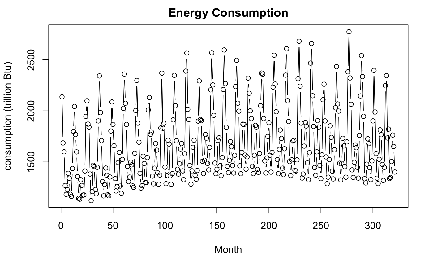
Well, how odd! The values seem like they move in a periodic pattern. Most likely due to seasonal consumption of energy. The two peaks may be explained by the energy used to heat homes in the winter and air conditioning during the summer. Otherwise, the plot doesn’t seem to have many abnormalities.
The Model
Next, we can do a similar process in identifying the parameter estimate and errors. But wait.. What are all these ones doing and what does this twelve mean? Well, if you have time, you might want to take a look at the explanations under the arima(1,1,1) for the first component. The next (1,1,1)_12 stands for the seasonal component of the arima model. The first three perform a time-series of additive data corresponding year to year while the last three ones take into consideration the oscillating month to month pattern (hence the 12 for the twelve months in a year). Of course, these values may be adjusted for further fine-tuned investigation, yet this model seems to suffice for general patterns.
library(astsa)                              # Don't forget to install necessary packages!!

# Fit an ARIMA(1,1,1)X(1,1,1),12 model and report the parameter estimates and standard errors.
energy.out <- sarima(energy,1,1,1,1,1,1,12)

# table of estimates
energy.out$ttable
Parameter Estimates with standard errors.
##      Estimate     SE  t.value p.value
## ar1    0.4757 0.0535   8.8909  0.0000
## ma1   -0.9594 0.0156 -61.5877  0.0000
## sar1   0.0520 0.0702   0.7403  0.4597
## sma1  -0.8436 0.0430 -19.6187  0.0000
Getting back to the table of estimates we notice that there is an ar1, ma1 corresponding to phi and epsilon of the annual data. There is also sar1, sma1 which are tied to phi and epsilon of the seasonal data. Where did the constant mu go? Well, this gets rather computationally greedy, but it can be simplified. Since arima estimates by maximum likelihood, mu gets derived away from seasonal differences as it intersects with the annual information.
Now on to the fun portion! We use the same sarima.for() function and put the same 7 values, but also specify 27 units ahead. Since we only have data from september 2017, we wanted to account for the last three months that we missed. Of course, you are free to play around with these parameters (maybe use some gridsearch. There is actually an arima model that does this).
# Forecast the US resindential energy consumption for the next 2 years.
# Next to years 2918-2919
energy.future <- sarima.for(energy, n.ahead = 27, 1,1,1,1,1,1,12)
energy.future$pred
These are the predicted values
## Time Series:
## Start = 324
## End = 350
## Frequency = 1
##  [1] 2182.191 2447.030 2024.739 1814.962 1360.982 1306.899 1482.496
##  [8] 1731.738 1677.478 1406.998 1316.272 1553.124 2140.969 2432.432
## [15] 2028.283 1807.156 1356.549 1299.898 1477.043 1725.974 1674.827
## [22] 1403.306 1309.507 1545.331 2134.530 2427.380 2024.174
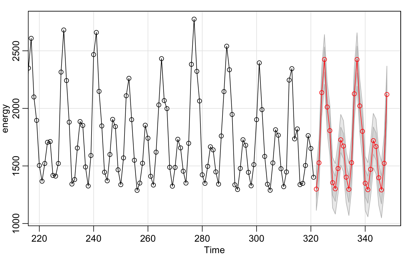
Now look at that! We have a simple graphic forcasting the next 27 months and the individual values. This was definitely less coding than a non-seasonal arima despite how fearful the data looks. There was no need to transform the data, and it takes half the lines of code.
One downfall to the sarima graphic is that we cannot specify the limits, title, or labels. We’ll just recreate this graph in Base R.
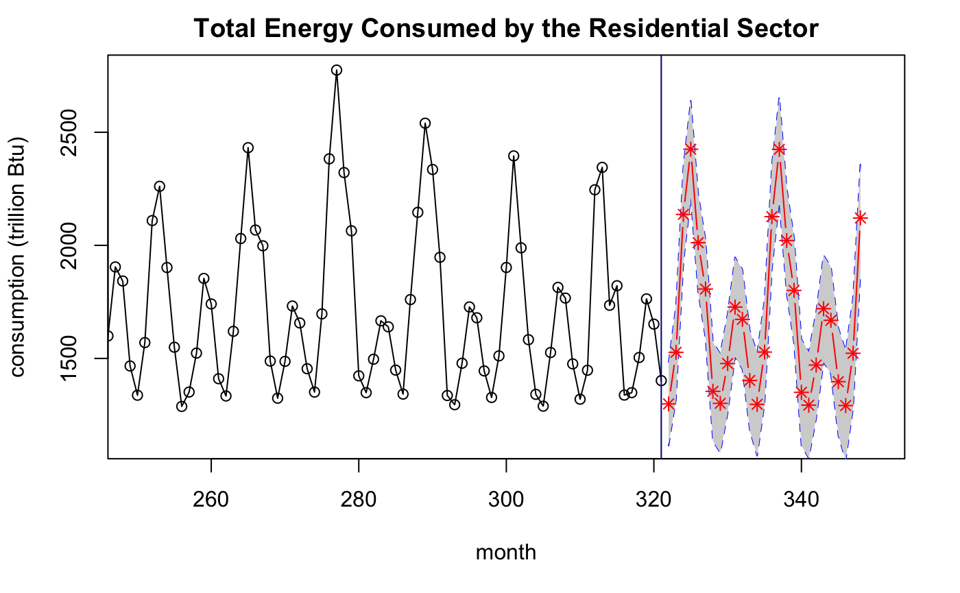
# Report a table of predictions and 95% predictions intervals.
L <- energy.future$pred - 2 * energy.future$se
U <- energy.future$pred + 2 * energy.future$se
cbind("prediction"=energy.future$pred,"lower"=L,"upper"=U)

# A publication quality graphic showing the historical values and the 2 year predictions
# (with uncertainty) of US residential energy consumption
plot(energy,
     type="o",
     ylab="consumption (trillion Btu)",
     xlab = "month",
     xlim = c(250,350),
     main = "Total Energy Consumed by the Residential Sector")
abline(v=321, col = "dark blue")
length(322:348)
lines(322:348,L,col="blue",lty=2)                                         # lower bounds
lines(322:348,U,col="blue",lty=2)                                         # upper bounds
polygon(c(322:348,rev(322:348)),c(L,rev(U)),col = "light gray", border=NA)# Filling in the lines between the upper
lines(322:348,energy.future$pred,col="red",type="b",pch=8)                # and lower bounds in the prediction.
Conclusion
The seasonal arima model is impressive as it flexibily represents several varieties of time series with simplicity. Of course, there are always weaknesses. For example, the same assumptions apply with the non-seasonal arima:
- It does not take into account unsuspected predictor variables or time deterministic trends.
- It looks from year to year.
Additionally, the weakness with this type of model is that the addition of more data does not necessarily mean more data points. It means more detailed data points that are included in the time frame. If more data is necessary, we will need quality descriptive data points in between each seasonal trend. If you have time on your own, give it a try!
Take a look at the sample data below and try it on your own.