Several of my friends are getting married and questions about rings have been thrown around. What kind of ring should I choose? Should I go for a diamond? How about moissanite? Or, what’s the whole point of even getting a ring in the first place?Most people don’t really care, but I aire on the side that a ring can be a bit of equity that you can carry just in case something happens. In some ways, a car and house have value and can be an additive investment; rings have the potential to work the same way depending on how you use it.

Case
Any ring shopper would like to know if they are buying the best price per quality. Let’s predict how much our diamond will cost given varying weights (carats).
Exploratory Data Analysis
There is an already imbedded dataset in R if you run data(diamonds) in your command line. This dataset is rather large and may take some machines a long time to process the information.
If you want to try a smaller set, go to the Texas A&M link. The data will look like this below.
url <- "http://www.amstat.org/publications/jse/v9n2/4Cdata.txt"
diamonds <- read.table(url,header=F,as.is = TRUE)
names(diamonds) <- c("carat", "color", "clarity", "cert", "price")
glimpse(diamonds)
## Observations: 308
## Variables: 5
## $ carat   <dbl> 0.30, 0.30, 0.30, 0.30, 0.31, 0.31, 0.31, 0.31, 0.31, 0.31, 0.32...
## $ color   <chr> "D", "E", "G", "G", "D", "E", "F", "G", "H", "I", "F", "G", "E",...
## $ clarity <chr> "VS2", "VS1", "VVS1", "VS1", "VS1", "VS1", "VS1", "VVS2", "VS2",...
## $ cert    <chr> "GIA", "GIA", "GIA", "GIA", "GIA", "GIA", "GIA", "GIA", "GIA", "...
## $ price   <int> 1302, 1510, 1510, 1260, 1641, 1555, 1427, 1427, 1126, 1126, 1468...
=========================================================================
We won’t be working with that set. Let’s take a look at the imbedded large one. The diamonds dataset is one of the great examples of how powerful R can be using big data. Unfortunately, we’re not touching all of it because we are only working a univariate linear regression.
Make sure to install the libraries for analysis! I’m also going to show you an interactive plot using plotly! Plotly is an interactive interface that allows for easier labeled visualization. With it, you can see individual plot points and easily recognize any outliers. Rather impressive, it definitely beats having to use the identify() function which gives you information but cannot glean quick-interactive information.
library(ggplot2)
library(dplyr)
library(plotly)
We begin by calling out the original diamonds dataset by data(diamonds). Since we only need two columns for the dataset, let’s clean the set and take a look at the plot. We have 1 factor with 53,940 levels, and one replication.
data(diamonds)
glimpse(diamonds)

diamonds1 <- diamonds[, c(1,7)]
rm(diamonds) # Get rid of old dataset. We only need columns 1,7.

#par(mfrow=c(1,2)) # puts two graphs on one pane. Only works for r script
plot(diamonds1$carat, diamonds1$price)
## Observations: 53,940
## Variables: 10
## $ carat   <dbl> 0.23, 0.21, 0.23, 0.29, 0.31, 0.24, 0.24, 0.26, 0.22, 0.23, 0.30...
## $ cut     <ord> Ideal, Premium, Good, Premium, Good, Very Good, Very Good, Very ...
## $ color   <ord> E, E, E, I, J, J, I, H, E, H, J, J, F, J, E, E, I, J, J, J, I, E...
## $ clarity <ord> SI2, SI1, VS1, VS2, SI2, VVS2, VVS1, SI1, VS2, VS1, SI1, VS1, SI...
## $ depth   <dbl> 61.5, 59.8, 56.9, 62.4, 63.3, 62.8, 62.3, 61.9, 65.1, 59.4, 64.0...
## $ table   <dbl> 55, 61, 65, 58, 58, 57, 57, 55, 61, 61, 55, 56, 61, 54, 62, 58, ...
## $ price   <int> 326, 326, 327, 334, 335, 336, 336, 337, 337, 338, 339, 340, 342,...
## $ x       <dbl> 3.95, 3.89, 4.05, 4.20, 4.34, 3.94, 3.95, 4.07, 3.87, 4.00, 4.25...
## $ y       <dbl> 3.98, 3.84, 4.07, 4.23, 4.35, 3.96, 3.98, 4.11, 3.78, 4.05, 4.28...
## $ z       <dbl> 2.43, 2.31, 2.31, 2.63, 2.75, 2.48, 2.47, 2.53, 2.49, 2.39, 2.73...
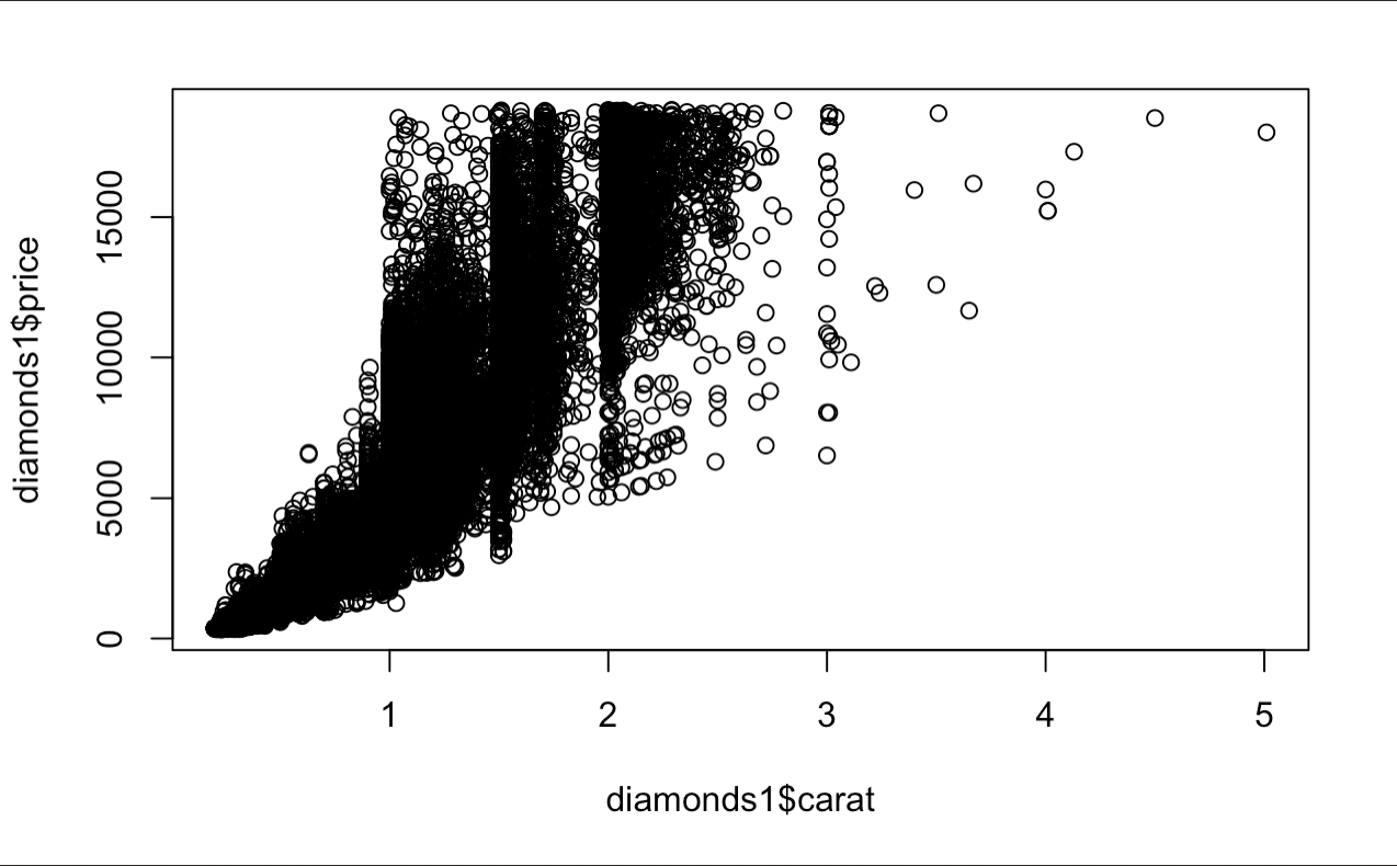
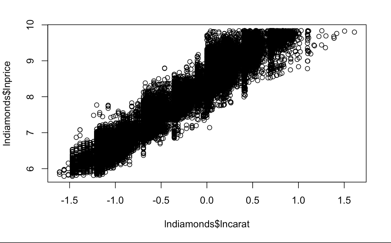
A lot more data than we thought. The trend of this information looks rather multiplicative rather than additive and the data is fan-shaped. This probably requires a transformation of some sorts. The fan shape is usually mitigated by a log transformation, so we will proceed to create a new variable below and plot the data.
lndiamonds <- diamonds1
lndiamonds$lncarat <- log(diamonds1$carat)
lndiamonds$lnprice <- log(diamonds1$price)
plot(lndiamonds$lncarat, lndiamonds$lnprice)
The Model
This looks more like some data we can perform an analysis in creating a model. Let’s proceed to fit the model for our analysis!
	Explanatory variable: log carat
	Response variable: log price
Here’s our model below. We will quickly go through the basics of the simple linear regression. Using the cell means model…
Model: yi = ßo + ßiXi + epsiloni, for epsilon ~ N(0,ø2)
- yi is new observation
- ßo is y-intercept (What our data looks like when we don’t have the carat effect)
- ßi is the slope coefficient (The predictor of per-unit effect on yi depending on xi)
- epsilon ~ N(0,ø^2) means that we are assuming that the errors are normally distributed.
This model looks a lot like a linear y = mx + b graph that we see in algebra. This is because it is based on the same concept. Simply said, this model takes every average value of yi estimated parameters and creates an estimate ȳ. So, when we are predicting, our model will look like this:
:::::: ȳ = ßo + ß1Xi + epsiloni, for epsilon ~ N(0,ø2)
As for our transformed data, it will look like this.
:::::: lnPrice = ßo + ß1 lnCarat + epsilon, for epsilon ~ N(0,ø2)
We can simplify this further, but that’s enough for now. Let’s get back to working this in R. All we need to do is run a linear model with the lm function and stick it into a summary function to get our parameter estimates and standard errors. I’m a big fan of using summary() rather than anova() for personal reasons, but here are both results.
out.diamonds <- lm(lnprice~lncarat,data=lndiamonds)
summary(out.diamonds)

1-sum((diamonds1$price - exp(predict(out.diamonds)))^2) / sum((diamonds1$price -mean(diamonds1$price))^2)
  # This is the R^2 for the non-logged data.
  # Variance explained by model / Total Variance
## Coefficients:
##             Estimate Std. Error t value Pr(>|t|)
## (Intercept) 8.448661   0.001365  6190.9   <2e-16 ***
## lncarat     1.675817   0.001934   866.6   <2e-16 ***
## ---
## Signif. codes:  0 ‘***’ 0.001 ‘**’ 0.01 ‘*’ 0.05 ‘.’ 0.1 ‘ ’ 1
##
## Residual standard error: 0.2627 on 53938 degrees of freedom
## Multiple R-squared:  0.933,	Adjusted R-squared:  0.933
## F-statistic: 7.51e+05 on 1 and 53938 DF,  p-value: < 2.2e-16
## [1] 0.8280731
Now from here, we can see that our ßo value is 8.448661 and our ß1 is 1.675817.
Our linear prediction model now looks like:
log Price of a 1 carat diamond = 8.449 + (1.68)Xi
Assumptions and Interpretation
Interesting fact about taking the log of both the explanatory and predictor, is that the ß coefficients can be explained as a % change (ie. for a 1% increase in carat size, the will be a 1.67% increase in price). This is the same as calculating elasticity.
Another important note to look at is the R^2 value for this model. You can see how R^2 may be manually calculated for the non-logged value (the logged one is part of the linear model). The logged values seem to explain more of the variability than the unlogged one (no-log = 0.828, logged = 0.933). For those that are not familiar with R^2, this indicates the percentage of variability that is explained by the model. For the most case, the higher, the better as long as the residuals are normally distributed. If you want more information, take a look at this site.
Let’ also take a look at the histogram of residuals to see if we have violated any assumptions of normality. We do this by performing a K-S test on the r-studentized residuals (residuals we have transformed to analyze in a normal curve. The standard deviations from the mean will match the same distribution).
  # Compute R-studentized residuals
  R.hills <- rstudent(out.diamonds)
  # how many sd away each point is from the center.
  2*(1-pnorm(R.hills))

# Compute K-S normality test on the R-Studentized residuals.
    # test of normality
    # H0 e's are normal
  ks.test(R.hills,"pnorm")
  hist(R.hills)
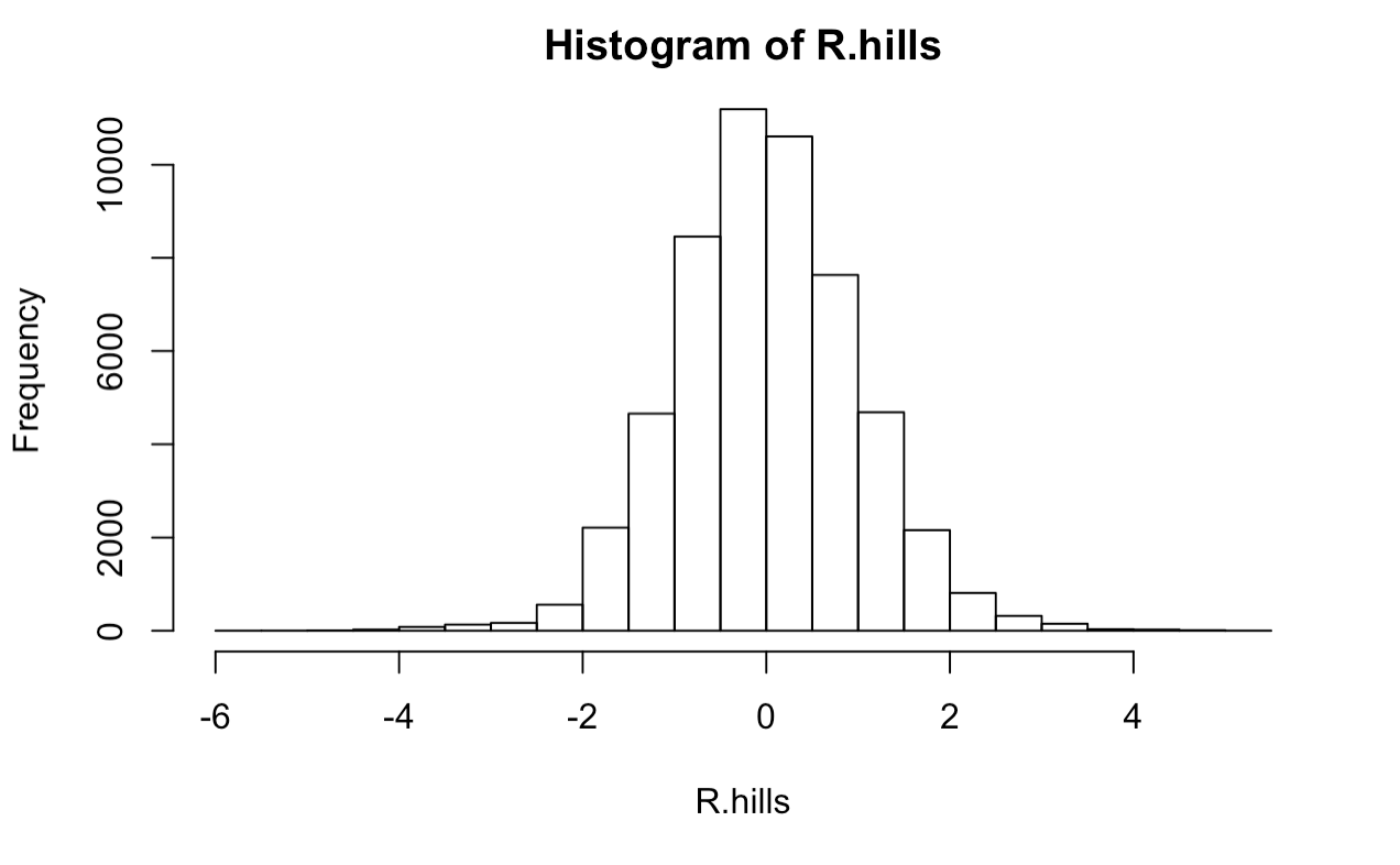
Not bad, it looks like we have a roughly normal distribution of errors which satisfies one of our assumptions! The K-S test is short for the Kolmogorov–Smirnov test, and is a hypothesis test with Ho: Residuals are not normally distributed. Our p-value from this output shows a p-value of <.001, so we can safely say that the residuals are indeed normally distributed.
Now returning to the summary output, we observe a p-value < 2.2e-16 and F statistic of 7.51e+05 df(1,53938). This corresponds to the “Ho: the size of a diamond does NOT have a statistically significant effect on the cost.” Therefore, at a p-value less than 0.0001, we have sufficient evidence to reject the null hypothesis and say that there is a statistically significant effect in price from carat to offspring and for a 1% increase in Carat size, we estimate an expected increase in Price of 1.676% in offspring sweet pea diameter (95% CI: 1.672%,1.679%).
confint(out.diamonds)

qplot(lncarat,lnprice,data=lndiamonds,
      geom = "smooth",
      formula = y~x,
      method = "lm",
      se = TRUE,
      xlab ="Size of Diamonds (log carat)",
      ylab = "Price (log)"
      )
##                2.5 %   97.5 %
## (Intercept) 8.445986 8.451336
## lncarat     1.672026 1.679607
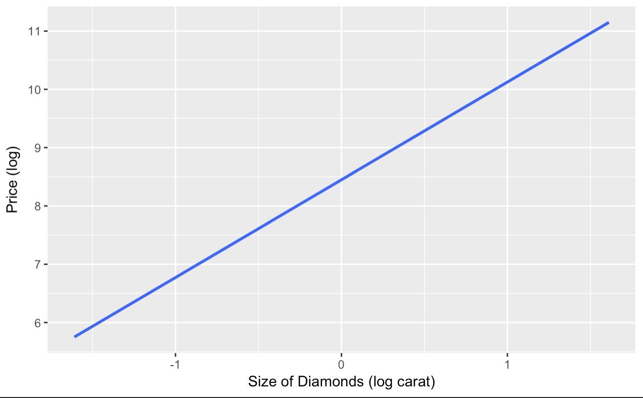
Our confidence interval is so small. Practically invisible. However, don’t freak out. This due to the data being loggedand a high number of observations (54,000). If you were a jewelry store manager we may see how useful this information is to predict, in our range, the price of the diamond from the size.
Plotly Predictions
Now, if you were a newly-wed couple trying to look for a ring and wanted to see the predicted price for a 1 carat diamond, we just need to use the predict() functionality and insert a new dataframe containing the desired x-value. If you transformed the data, make sure to un-transform the information to correctly interpret (using exp())!
exp(predict(out.diamonds, newdata=data.frame(lncarat=1), interval="prediction"))
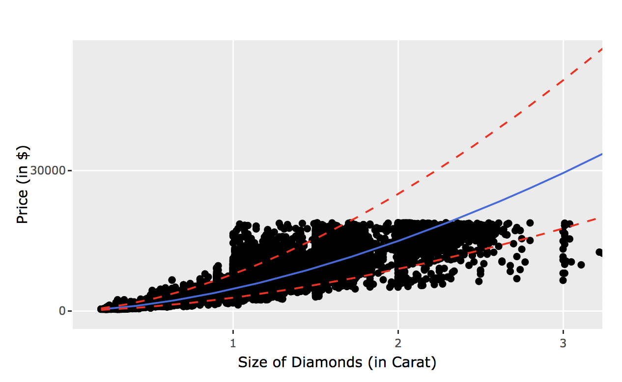
plot.df <- cbind(diamonds, exp(predict(out.diamonds, interval="prediction")))
p <- ggplot(plot.df,
aes(carat,price)) +
xlab("Size of Diamonds (in Carat)") +
ylab ("Price (in Singapore $)") +
geom_point(color = "black") +
geom_line(aes(y=fit), color="royalblue") +
geom_line(aes(y=lwr), col="red", linetype="dashed") +
geom_line(aes(y=upr), col="red", linetype="dashed")
ggplotly(p)
The plot above is rather neat huh? Click around and you notice how you can check out individual plot elements. This is perfect for when you are creating reports for managers to show them individual datapoints and explaining outliers.
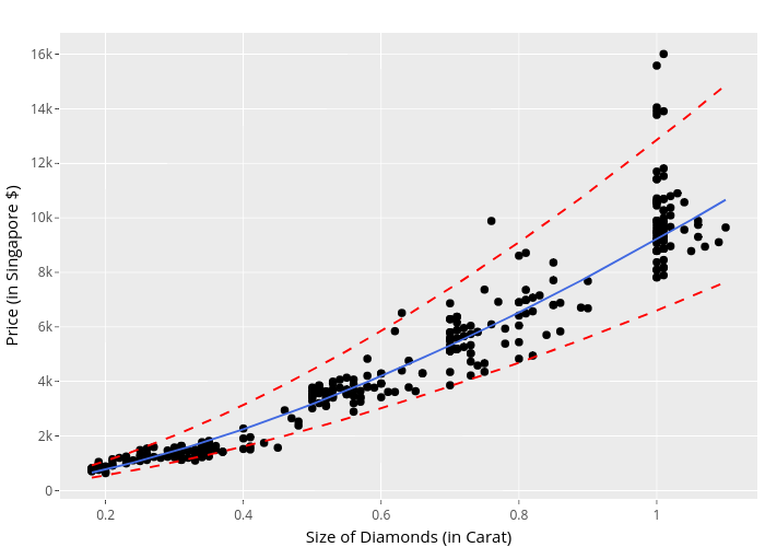
Here’s a secret.. this isn’t the actual data. You could probably tell by the lack of data points and the axis labels. This was from the first mentioned dataset from amstat.org. If you try to publish the ggplotly(), it will slow down your machine without some serious RAM.
Here’s the actual plot below with the prediction output.
##       fit      lwr      upr
##1 24946.22 14907.68 41744.49
For a one carat diamond, we can expect a price of about 24946.22 with a 95% prediction interval between 14907.68, 41744.49. These large prediction intervals are pretty expected as they are not the same as confidence intervals (for more information on the differences, click here). Also we should note that the carat amount rises, there is more volitility in price. This means that there is more of a chance for someone to rip you off! Of course, this data is not including the fitting and cutting of the ring, the other C’s included (cut, color, clarity), but it is rather relevant information.
Conclusion
Remember, this is not a perfect model to predict price. Just one simple linear regression does not tell any other information we are missing! Later, we will cover more detailed analyses with more covariates.
As for the plotly library, we now know that there are limits to visualization. Good to know for the future; enjoy coding!