Polynomial regressions and basis function expansions:
Dataset Transformation for non-linear models can get tricky, but there are several ways to go about it. Aside from the regular exponential or logarithm regressions, there are more accurate ways to model complex data.
I was first introduced to Basis Function Expansions from the Mass library in R. This lets you pull out a dataset mcycle in order to measure the simulated head position during a motorcycle accident (in milliseconds).
The original dataset is fit with a model (red line) that approximates a value given a specific range. Mine looks like this. vv

Supposedly, this is one famous dataset that is used by many to practice model fitting. Good thing we have it available in R. Download my code here so you can take a look at what I had done.
Before we try this on our own, I just want to include a brief overview of what it means to run a basis function expansion.
A BFE overwrites specific attributes of a datasets with various transformations of these attributes. For example, in a specific variable X, we can expand this specific example to capture nonlinear trends. It is very useful in various learning algorithms or any abnormal statistical procedures. Just know, polynomial regressions aren’t the only way to fit a basis function expansion. If you take into consideration categorical variables, there are so many other things to consider. Yet, for this case, take a look at the way we do this “feature engineering”.
x <- sample(0:100,10,replace=T)
cbind("y" = 1,"x" = x, "x^2" = x^2,"x^3" = x^3,"x^3" = x^4)
##       y  x  x^2    x^3      x^3
##  [1,] 1 21  441   9261   194481
##  [2,] 1 59 3481 205379 12117361
##  [3,] 1 27  729  19683   531441
##  [4,] 1 55 3025 166375  9150625
##  [5,] 1 40 1600  64000  2560000
##  [6,] 1  2    4      8       16
##  [7,] 1 26  676  17576   456976
##  [8,] 1 96 9216 884736 84934656
##  [9,] 1 30  900  27000   810000
## [10,] 1 90 8100 729000 65610000
So, we can observe our x matrix above (for you matrix algebra people)! These specify the variables where there is no change, x, x^2, x^3, and x^4. The higher the polynomial, the more accurate the prediction. This is derived from Taylor’s theorem and directly applied to the BFE.
Let’s now take a look at the titanium dataset and try to fit our model that we will create.
Instead of creating fake data, I decided to find another one on my own. After a lengthy search for datasets that use may use best fit models, I finally found one. This one was tricky because it actually came from the embedded MATLAB dataset. I couldn’t find any other way than to pull the information out of Matlab and create a new csv out of the information. Download the csv here.
My guess is that this dataset is the tensile elongation of Titanium depending on the heating rate of titanium, but what do I know about natural sciences? Nothing at all, but I do know that I can model a regression model off of the data!
My first step is to load my libraries. I explained a bit about the car library in one of my last entries. The new library we will use comes from splines. This package lets us run a type of polynomial regression model that utilizes divided sections within the dataset. I’ll explain more in a bit.
library(dplyr)
library(car)
library(splines)
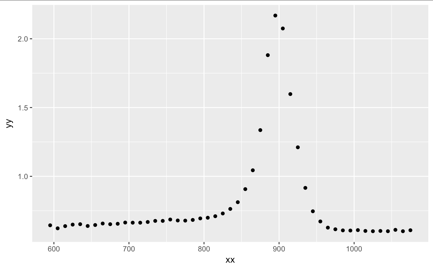
After we load our packages, let’s upload our titanium dataset. After plotting the information, we see a nice curvature and peak at around 900. I am assuming that the x axis is the temperature range (most likely in kelvin, yet I am sure Celsuis and Fahrenheit can get large too) and y is the characteristic of the titanium. Assuming these characteristics, we see that there is a certain threshold of temperature that the titanium holds until it returns to its former state.
setwd("~/Desktop")
titanium <- read.csv("~/Desktop/titanium.csv",header= T)
qplot(xx,yy,data=titanium)
Alright, let’s get started with creating our polynomial regression. The beginning is easy. All we do is fit a linear model using the same explanatory variable to a certain degree. There are a few things that are different here from a regular linear regression. First, we have the I. It means, create the column and stick it in the x matrix. The phrase x = TRUE let us see what exactly our x matrix will truly look like. Let’s try working with a 5th order polynomial.
out.metal <- lm(yy ~ xx + I(xx^2) + I(xx^3) + I(xx^4) + I(xx^5),
           data = titanium,
           x = TRUE)
tail(out.metal$x)
##    (Intercept)   xx I(xx^2)    I(xx^3)      I(xx^4)      I(xx^5)
## 44           1 1025 1050625 1076890625 1.103813e+12 1.131408e+15
## 45           1 1035 1071225 1108717875 1.147523e+12 1.187686e+15
## 46           1 1045 1092025 1141166125 1.192519e+12 1.246182e+15
## 47           1 1055 1113025 1174241375 1.238825e+12 1.306960e+15
## 48           1 1065 1134225 1207949625 1.286466e+12 1.370087e+15
## 49           1 1075 1155625 1242296875 1.335469e+12 1.435629e+15
From the output we can compare it to the original fake data I created above! It’s pretty similar huh? Just a cryptic way to create a column using an x matrix which is created by higher order polynomials. Cool, let’s plot this against our original plot
plot(titanium$xx,titanium$yy)
x.star <- seq(550,1200,length=100)
yhat1 <- predict(out.metal,newdata=data.frame(xx=x.star))
lines(x.star,yhat1,col="red")
median(abs(resid(out.metal)))
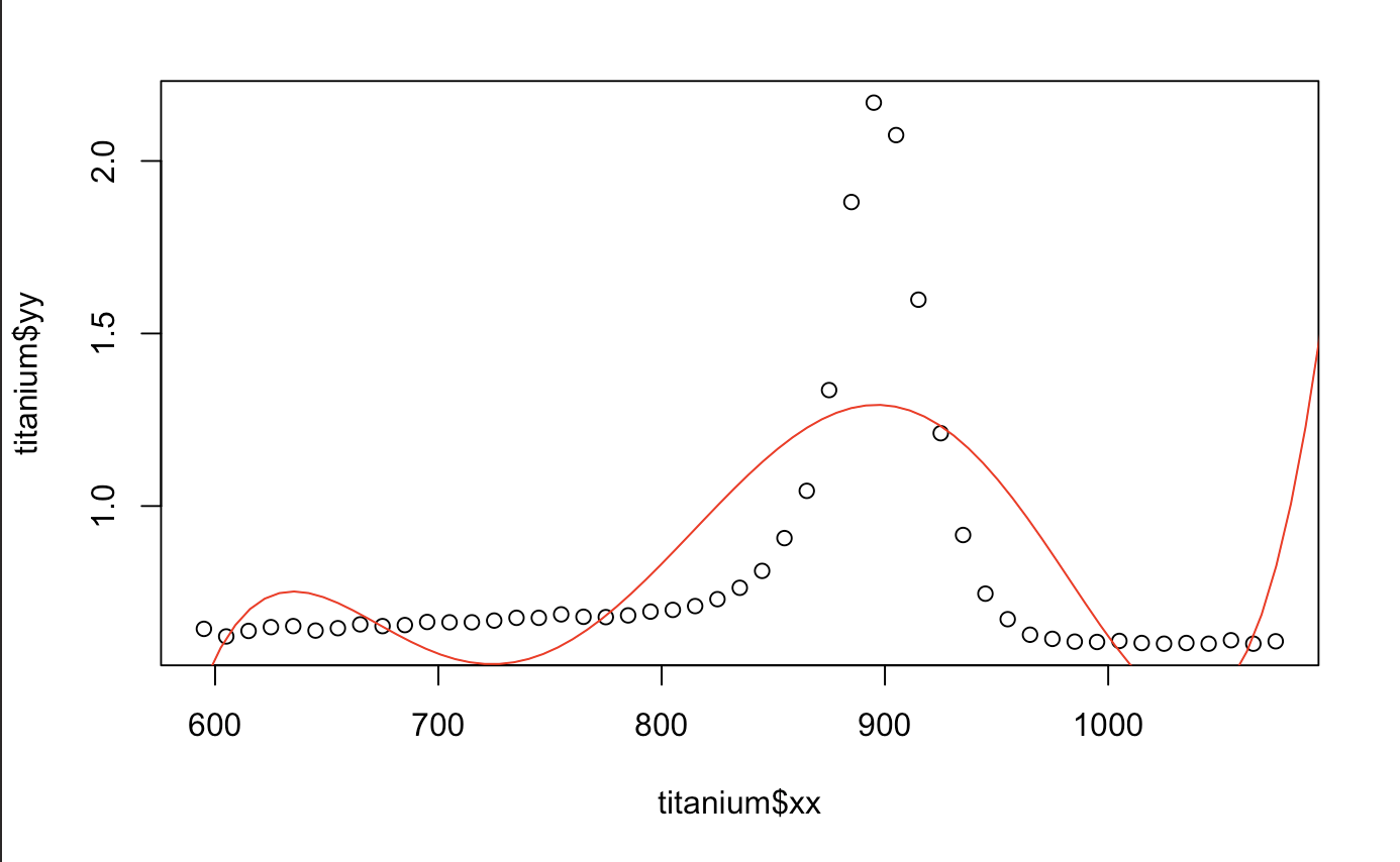
## [1] 0.4380222
Hmm.. That looks okay. We can also tell that polynomials do terrible in extrapolation. Any value outside of what we have does not seem to do what the data wants us to. Good thing there isn’t any discontinuity in the derivative or we would have an even more difficult time fitting the model (the motorcycle one does). We also take a look at the prediction performance from the median absolute prediction error. It is also written as Medium Absolute Prediction Deviation (MAD). The smaller, the better.
After deciding that I didn’t want to check how many polynomials to actually go for before finding the best fit, I just used the function poly() and put it through a for loop. I was rather surprised that it worked! poly() becomes an extremely useful tool in BFE models as it allows for creation of orthonormal polynomials (It avoids the collinearity problem). It pretty much multiplies itself with the identity matrix and creates a more orthogonal self. It’s a very useful function and likely allows for better predictions.
med <- numeric(0)
for (i in 1:25) {
outs <- lm(yy ~ poly(xx,i), data = titanium, x = TRUE)
med[i] <- median(abs(resid(outs)))
}
plot(cbind(seq(1:25),med))
abline(h=min(med), col = "red")

We do notice, for the most case, that the higher order polynomial, the smaller our MAD gets. Overall, it looks like the 14th polynomial is one of the best fits. Let’s take a look and see for ourselves.
out.T <- lm(yy ~ poly(xx,14), data = titanium, x=TRUE)
plot(yy~xx, data = titanium)


x.star <- seq(550,1200,length=100)
yhat1 <- predict(out.T,newdata=data.frame(xx=x.star))
lines(x.star,yhat1,col="red")
median(abs(predict(out.T)))

## [1] 0.1998364
It certainly does look better, but there is most certainly a better way for us to figure this out. A statistician would probably say that this data is too “wiggly”. Funny huh? Yet, it’s true. There must be a better way for us to predict the segments. This is probably where splines will be a better technique. Let’s give that a try!
Essentially, a Cubic spline is another type of BFE. Let’s first divide up the x space into segments and put certain unknown values as the knots (C). Within a knot, we’re going to put in a cubic function. At the knot, we have to make each value continuous, so we will need something that has the same 1st derivative and 2nd derivative. This will allow for each segment to obey the smoothness condition.
Luckily, someone WAY smarter than me has figured out how to do all of this. Theoretically, it makes some sense. Let’s try to map this out. Here comes the part where we use the splines library. They made the coding very simple. ns() is just shorthand for number of splines. Let’s just divide up the space by 14 segments.
titan.out <- lm(yy ~ ns(xx,14), data = titanium, x = TRUE)
plot(yy~xx, data = titanium)
x.star <- seq(550,1200,length=1000)
yhat1 <- predict(titan.out,newdata=data.frame(xx=x.star))
lines(x.star,yhat1,col="red")
median(abs(resid(titan.out)))

## [1] 0.1427391
That looks a lot better, doesn’t it? Keep experimenting until you find something better. I think the one I felt most comfortable with was at around 20 splines.
I guess we can see just how powerful this modelling technique can really be. If we use the summary() function on our model, we can even see that our p-value is less than < 0.0001,
adjusted R^2 is at 0.9778 and RSE is extremely low at 0.056. Our predictions seem to be pretty accurate. You can even use confint(titan.out) to see how small these margin of errors truly are.
summary(titan.out)
## Residual standard error: 0.05581 on 34 degrees of freedom
## Multiple R-squared:  0.9843,	Adjusted R-squared:  0.9778
## F-statistic: 152.2 on 14 and 34 DF,  p-value: < 2.2e-16
I hope that this can serve to shed some light on how to modify these polynomial or BFE models. I really hope that I get a chance to use something like this outside of what I am doing now.
Hope you guys enjoyed these fun-looking models!